The standard of the classics, considered by many to be the most trusted typeface in the world.
Industrial, calm and solid, ideal for branding design.
This early baroque typographic gem is crafted with passion to variable font.
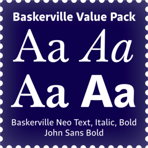
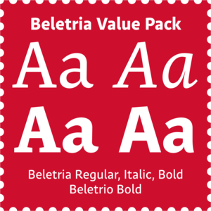
A smart selection of four fonts considered by many to be the most trusted typefaces in the world, at a great price.
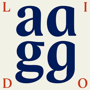
Lido was created before the year 2000, in the conditions of developing digital typography.
Czech Modernist Masterpiece.
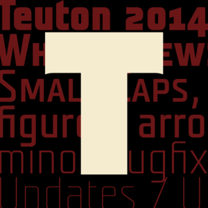
Teuton, designed in 2002, is immediately inspired by an inscription on one German tomb in the Sudetenland, and also by funeral lettering as performed in the first half of 20th century in glass or granite.
Baskerville's perfect companion.
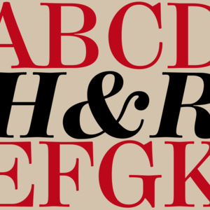
Where Modern is too fragile and Century too boring, Hercules comes with its elegant forms and, at the same time, with sufficient firmness to be usable for longer texts.
Realiable scientific text workhorse.
There is a moment in everyone’s life when they start wearing glasses and I am no exception.
A universal typeface for books, magazines and newspapers is economizing, quiet, strong in drawing, but original and peaceful at the same time.
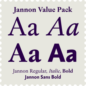
Upon numerous demands of highly esteemed users of our fonts I decided to supplement the Walbaum type family by display and poster cuts.
Designing font family systems has become a fashion ever since the beginning of digital typography.
Baroque design, music and architecture, historical books, catalogues, posters and social media.
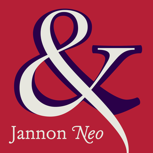
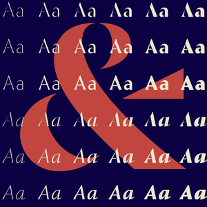
A confession of love for baroque typography.
Cold, perfect and strict organizer.
Essential high-contrast headliner.
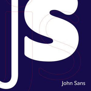
A sans-serif that is NOT neutral.
Our eye is able to join missing parts of worn letters back into undisturbed shapes.
Metron is so far the most ambitious typeface made to order in the Czech Republic.
Contemporary legible font kit.
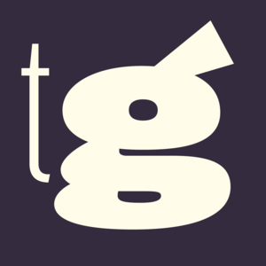
Trivia Gothic draws inspiration from notorious origins, whose features are here conveyed into extremes: a warm expression, sharp diagonal endings of curves and ascenders, and a moderate contrast of shadows.
My professor's masterpiece.
Modern humanist book typeface.
Art-Deco grotesque with new lowercase in 2023.
This Antikva and Italic are well-known perhaps to all Czech graphic artists and typographers ever since their release.
Reliable scientific sans-serif.
The most inconspicuous typeface from our catalog.
Matrix dot printer font with rounded edges.
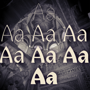
The land of beauteous angels, Andalucia, connects different cultures with a curved arch.
Andulka was drawn in 2004 for the purposes of publication and visual identity.
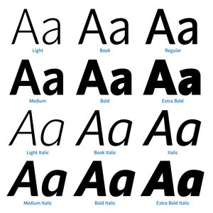
The traditional division of a type-face family into four designs pertains to every body type.
The concept of the Baroque Roman type face is something which is remote from us.
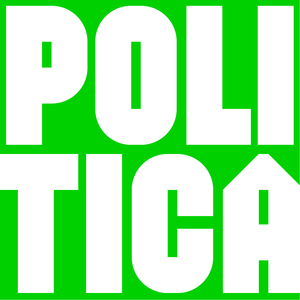
Politic A, B, C, and D, have a very simple construction composed on a grid.
Another confession of love for baroque typography.
Tested by centuries of reading.
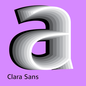
Clara system is a superfamily of related sans and serif fonts, ideal for magazine, identity and corporate design use.
For a counterbalance to sweet and tender Andulka and Etelka, we assumed to create some masculine font havig serifs looking like offroad tyre claws.
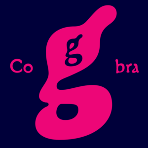
A cross between a Roman type face and a slug, a type face with blurred letters, inspired by a tropical snake remotely contained in the letter "g".
Inspired by a tombstone lettering dated from about 1900.
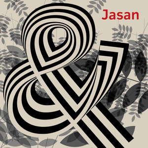
Jasan is the Czech expression for ash tree (Fraxinus Excelsior) which provides great wood for tools and furniture.